Your website copy is fantastic – so you want your visitors to read all the great things you have to say.
Selecting fonts is a crucial component of designing your website.
If you want to make your key messages stand out and show your reader why they should choose your business, your fonts and typography needs to be just right.
If you want to make sure that everything you’ve written on your website is easy to read and digest, read on!
We’ve outlined some key things for you to consider when considering website font and typography.
Why is font so important?
You want every person that visits your website to receive and understand your message. To do this, it is essential that your text is easy and quick to read.
It is important to remember the following key pieces of information:
- 60% of the UK population wears glasses
- Your webpage has 5-8 seconds to attract visitor’s attention
- 10% of the UK is dyslexic
- 8% of the UK doesn’t speak English as a first language
- 5% of the UK is colour blind
You want to ensure that all your visitors can read your copy, not just a small proportion. It’s easy to allow your…
- Website design
- Choice of words
- Fonts
- Lettering style
- Line spacing
… to exclude some people from being able to pick up your message clearly (or even alienate them) … and these people may have the potential to be your best customers!
So, you’ll want to ensure your text is readable by all, including dyslexics, glasses-wearers, and those who are colour blind. You also need to make your website easy to read by those who don’t speak English as a first language or have reading impairment.
To do this, your copy needs to be clear and jargon-free, using short sentences and everyday vocabulary.
By doing these things, you will maximise the number of visitors that can read your website.

60% of the UK population wears glasses – so you need to make sure they can read your text
Easily readable text
Start by making it easy for glasses wearers, otherwise you could reduce your potential client base by 60%.
To do this, your webpage must:
- Avoid small lettering or feint lettering
- Use images & diagrams to illustrate your copy
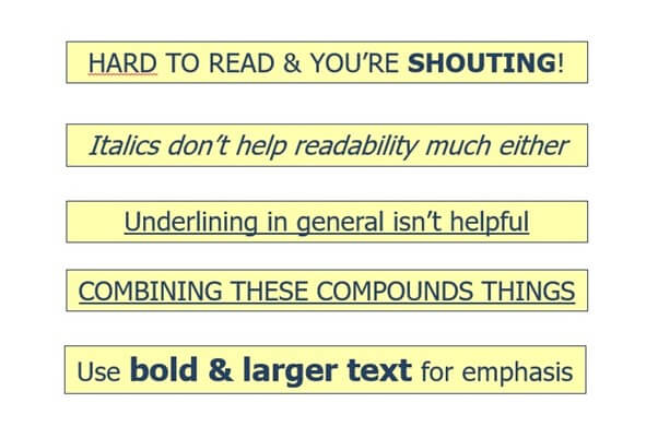
- Emphasise key messages in bold
- Avoid underlining, italics & block capitals
Road signs don’t use capital letters for a reason! Not only are they difficult to read, but BLOCK CAPITAL LETTERS are seen as SHOUTING at your CUSTOMERS, which isn’t recommended in any situation.
People with reading difficulties, including dyslexia, find adding extra lines to the text reduces clarity. So underlining or using curly, script text reduces readability (doing both is a typographic sin!)
So what should you do?
Use a combination of sentence or title case (i.e. both upper and lower case).
Use bold to add emphasis – but don’t over do it or you won’t emphasise anything.

Line and text spacing
Increasing the spacing between lines by a small amount will make it easy to read. Avoid bunching or stretching the font. Basically, giving your copy room to ‘breathe’.
Colours & backgrounds
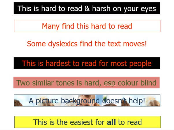
Some colours and colour combinations are easier to read than others. For example, red or pink text often shakes or blurs for dyslexics. Place a red font on a dark background and no-one will like it.
Red is also the colour of danger and can make your reader feel anxious, which isn’t the emotion you want them to feel.
You may be tempted to use red to emphasise certain words – but this has the opposite effect on many people and makes it very difficult for some groups.
Remember that 10% of the population is dyslexic and they could be great your potential customers … if only they could read what you had written easily.
Additionally, make sure you use a dark font on a light background: white text on a dark background is hard to read, for example.

Helping the colour blind
Did you know that 4.5% of the UK is colour blind?
By making your website accessible to colour blind visitors, you increase the number of potential clients available to you. You need to consider the colour of your text background in order to do this.
Two similar tones are difficult for colour blind people to read, as they cannot distinguish between the two colours. Colour blindness occurs typically in two ways red-green and, less commonly, yellow-blue.
So, if you put a red and green on top of one another and they have the same tone/depth of colour, you will render it difficult for some people to read.
Great text and background colour combinations are:
- Dark blue or grey text & a pale yellow background (one of the easiest)
- Black text & white or pale cream background
- Dark grey text & white background
The best way of presenting text is a light background and dark text.
If your background and your text are both light or both dark, many web visitors will find reading your text difficult.
If you want to maximise the number of visitors that read your message, make sure you pick your font and background colours carefully!
Should I use a background image?
Many people like to use interesting backgrounds to bring more life to their website. It’s a great idea – just don’t use it behind your text! Your writing is the most important thing on your website, so make sure it stands out without distractions. Make sure your text background avoids:
- Vignette (fading between colours)
- Texture (such as brick or fabric)
- Picture
- Watermark
- Pattern
To make your message easy to read, you need to avoid the above. Each background distracts from your message.
If you want your message to have the maximum impact, stick to a plain, pale background for the best results.

Textured backgrounds, like above, distract from the main message of your text
Which font should I use?
You need to select a font that looks great on your website. Here are three fonts to choose from:
- Serif
- Semi-serif
- Sans-serif
A Serif font has ‘little feet’ at the bottom. Times New Roman is a common example. It adds some complexity to your font, and works well in print, such as in Newspapers.
If you want your text to be readable, Serif font isn’t the best option. Whilst a semi-serif font is quite good, it can sometimes get muddled up by certain browsers.
Sans-serif fonts are very clean and the easiest to read. You should use these on your website.
Great examples include:
- Arial
- Tahoma
- Opens Sans
- Lato
There are loads of different fonts out there. Some look really sophisticated, clever, trendy and fun – and you may be desperate to use these.
For your message to have the maximum effect, simple is always better.