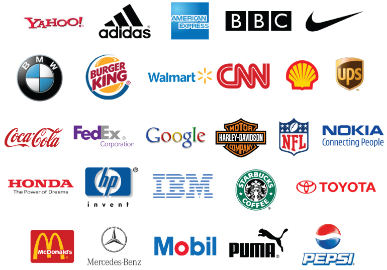
Your business needs to stand out from the crowd – and an eye-catching company logo is key to achieving this.
Your logo needs to be instantly recognisable, easy to understand, and represent your business appropriately.
Ideally, it should create a positive subconscious response in your prospects and customers.
Choosing the right colours, fonts, ‘device’ (picture) and strapline therefore requires some consideration.
In this article we’ve outlined some key things for you to consider when designing your company logo.

Your colour scheme
You may think that the colours you choose for you logo don’t make a difference – but you’d be wrong!
Different colours create different associations in your prospect. To decide which colours you should be using, you first need to understand your brand.
Think about whether your brand is:
- Upmarket, midmarket, or economy
- Fun or childlike (for example a nursery)
- Contemporary, cutting-edge or traditional
- Professional or informal
- Soft or powerful
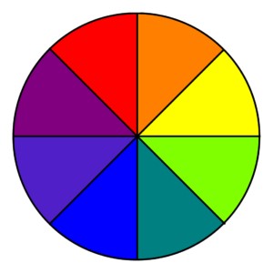
Once you know these things, you can find a principal colour, and perhaps one or two suitable contrasting or toning colours. You can use a colour wheel to help you (to choose these supplementary colours).
Most companies use their logo colours throughout their literature and digital collateral, to create consistency and a good brand story.
It’s important that one or more of your colours can be:
- Tinted
- Used for text
- Used for keylines & borders
- Used as strong highlighters
- Easy to get an accurate colour when printing

For example, a red tint is in fact pink, which won’t be the striking effect you are looking for.
Purple also often turns blue in print, so you need to be wary of this when printing your logo.
Where you want a really good match to your brand colour when you print then you can use a swatch for matching, not just a pantone reference.
To get your logo as great as it can possibly be, you need to consider colours when designing and using it.
Selecting your font
Choosing your font is much like selecting your colour. You need a font that is easy to read and matches your company’s tone. Most of all, make sure your font is appropriate.
You may want a playful font, but it may not be appropriate in your industry, or it might be difficult to read. Key things to consider include:
- Readability
- Serif use – with, semi or sans serifs
- Styles – for example a script style
Any font with serifs tends to look old-fashioned and is often difficult to read. Meanwhile, script styles are most appropriate in the creative industries but can be more difficult to read.
This doesn’t mean your font or logo has to be boring – simply appropriate to what you do for a living.
Your font colour also needs to be accessible to all.
Remember that:
- Bright fonts may be difficult to read or digest
- Red is hard for dyslexics to read
- Yellow & lighter colours are too pale to read
For your logo to have the maximum impact, its colour and its design needs to be perfect, as well as the font itself.

An eye-catching logo device
As well as carefully selecting your logo’s font and colour, you also need to make the design instantly relevant to your company.
Many effective logos have a suitable ‘device’. This is the image or symbol used in your logo that reinforces what you do. For example:
- Nike’s tick
- Apple’s half-eaten apple
- Google’s ‘G’
- McDonald’s ‘M’
- Toblerone’s mountain

Your logo tagline
It is important to give your prospects a clear sense of what you do.
Tesco spends millions each year ensuring that everyone knows their ‘every little helps’ tagline. But most businesses don’t have large sums of money to get a tagline that’s known worldwide.
So, for smaller businesses, their tag needs to stand up on its own (without a million pound advertisement campaign). Ideally, your fantastic tagline needs to:
- Include ‘you’ – show empathy to your client
- Say what you do
- Show quality or expertise
- Be short & jargon-free
For example, a marketer might use ‘Essential marketing to grow your business’ (sound familiar?!).
By creating a tagline that matches the above bullet points, your tagline reinforces your market and brand position – and makes your prospects remember you!
Looking good – everywhere!
Your logo must look great everywhere – from your website to your letterhead.
Different platforms require logos to appear in different shapes, so make sure yours is adaptable to do this.
You are likely to need both an oblong and a square variant for different digital platforms.
You are likely to need both an oblong and a square variant for different digital platforms.
Perfect your logo in different environments, including:
- Digitally – especially your website banner
- Printed stationary – including business cards
- Social media platforms
- Favicon (used on your web browser tab)
- E-sign off
- Large signage
- Staff uniform (if applicable)
- Vehicle livery
Adding a logo to staff uniforms can be complex – they can either be screen printed or embroidered.
Embroidery typically lasts longer but only is in one colour, so your logo therefore needs to work well in monochrome.
Large signage is one of the many places where your logo needs to look great
Keep in mind that something which looks great on A4 paper can look completely different when ‘blown up’ to large proportions or when shrunk to a tiny favicon. Pay attention to this and ensure that your logo looks good – everywhere!
Remember that your logo is just one part of your company’s branding story. Branding is a wider subject of which your logo is just one part.